

Wilton Ergon
-
Posts
626 -
Joined
-
Last visited
-
Days Won
21
Content Type
Profiles
Forums
Events
Everything posted by Wilton Ergon
-
I don't know if I was clear, but I mean the text of the grouping, and not the content of the columns.
-
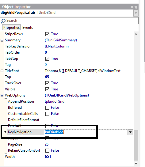
I have some groupings on the grid, with very large text, is there any way to force the line break to view the full text. the grid lines are perfect, showing all the content.
-
it didn't have to be that simple. i love unigui.
-
I made a routine where I capture the jsname of the controls, and record it in a database, this routine displays guidelines of the system when the user clicks on the component, it happens that the unigui internally changes the jsname of the controls, for no apparent reason, I would like to fix the jsname of some controls so they don't change. I tried to use UniPanel.JSName: = 'PNL100'; but it is a read-only property
-
I have the same problem with this link, when typing the date in the tunidatetimepicker component the solution presented in the link works is there any way to apply this to all tunidatetimepicker controls in the project because I have hundreds of date controls in my project.
-
Perfect, thanks
-
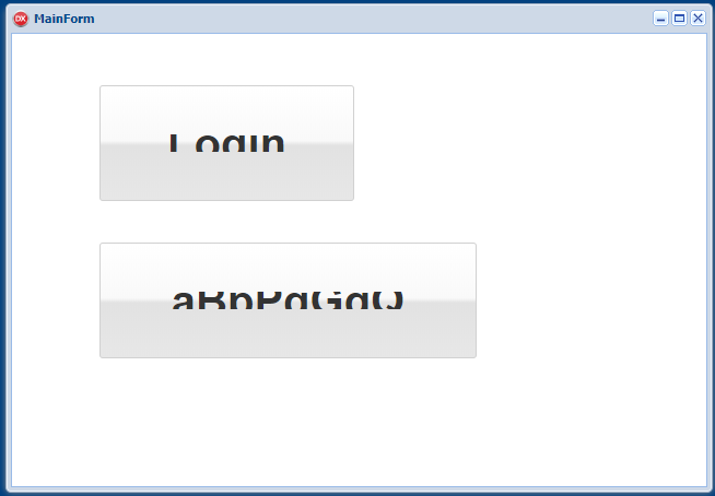
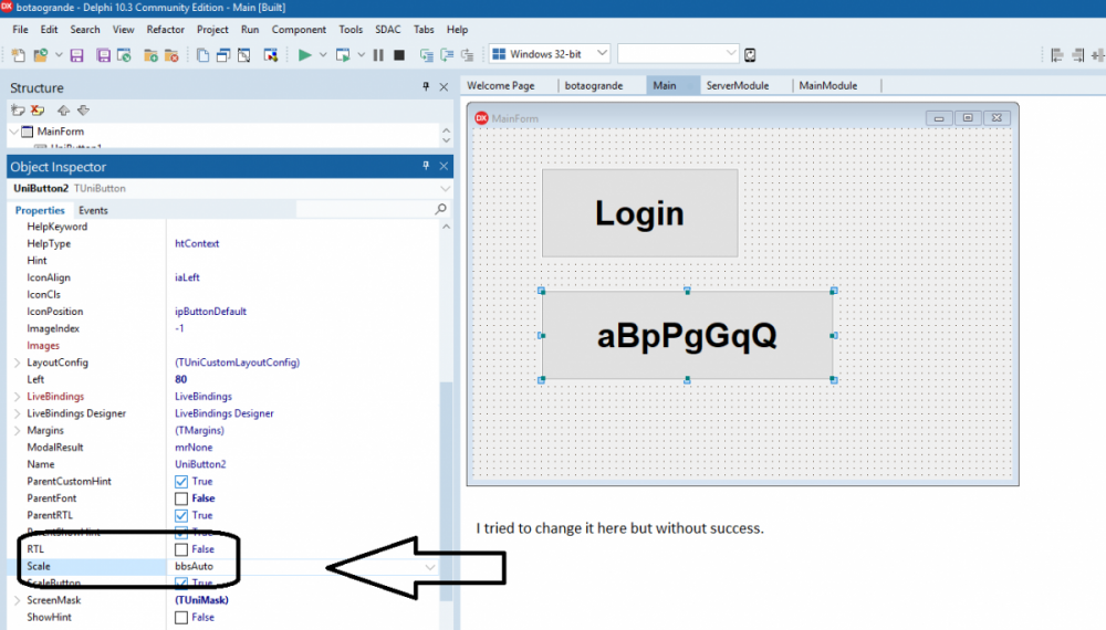
are having problems with big buttons, the text is cutting, I created a clean project, added a tunibuttom, increased the font, and when running and shown as shown in the image. delphi tokyo comunity 10.3 unigui 1.90.0.1523
-
my css collection, used in servermodule, customcss /*------- CONFIGURAÇÕES DAS TABS ---------------- */ /*Altera a parte superior da Tab, incluso tabs*/ .x-tab-default-top { border-top-left-radius: 0; /*Radius arredonda os cantos*/ border-top-right-radius: 0; border-bottom-right-radius: 0; border-bottom-left-radius: 0; padding: 5px 10px 10px 10px; /*T-R-B-L altura dos botões*/ border-width: 0 0 0 0; /*Borda dos Botões da Tab*/ border-style: none ; /*solid*/ border-color: #32404e; background-color: #ffffff; /* #1e3b5e Cor do Botão da page */ background-image: none; } /*Cor da fonte do botão da Tab ativo*/ .x-tab-default-active .x-tab-inner { color: #000000; } /*Distância do botão fechar para as margens*/ .x-tab-default .x-tab-close-btn { top: 4px; right: 4px; } /*Intensidade do fundo mask-box ajuste a Opacidade*/ .x-mask { opacity: 0.4; background: rgb(0, 0, 0) none repeat scroll 0% 0%; } /*Opções do Hold Overlay*/ #holdon-overlay { opacity: .7 !important; } /*Retira as bordas dos paineis*/ .x-panel-body-default { border-width: 0; border-style: none; padding: 0px 0px 0px 0px; /*Margem do painel da tab*/ } /*Coloca sombra em qualquer Panel*/ .pnlcard { box-shadow: 0 8px 6px -6px gray !important; background:white !important; border: 1px solid silver !important; } /* .x-tab-bar-default-horizontal { height: 0px; }*/ /* Cores da Tab*/ .x-tab-bar-default{ border-style:none; border-width:0 0 0; border-color:#ffffff; background-color:#ffffff; background-image: none; } /*Cor fonte pag ativa*/ .x-tab-active .x-tab-inner { color: #ffffff !important; } /*Altura dos botões em relação a borda inferior da Tab*/ .x-tab-bar-default-top { padding: 5px 0px 5px 0px; /* T-R-B-L */ } /*Modifica a barra inferior do botão*/ .x-tab-bar-strip-default { border-style: solid; padding: 3px 3px 3px 3px; /*T-R-B-L altura dos botões*/ border-color: transparent; background-color: #32404e; } /*Cores de fontes do label da Tab em foco*/ .x-tab .x-tab-inner { font-weight: bold; color:#000000; border: none;} .x-tab-over .x-tab-inner { font-weight: bold; color:#7c7c7c; border: none;} .x-tab-active .x-tab-inner { font-weight:bold; color:#ffffff; border: none;} /*Cor tab mouse over*/ .x-tab-over.x-tab-default-top, .x-tab-over.x-tab-default-left, .x-tab-over.x-tab-default-right { background-image: none; background-color: #e3e3e3; } /*Cor da Fonte da Tab Ativa*/ .x-tab.x-tab-active.x-tab-default .x-tab-inner-default { color: #ffffff; } /*Cor da Tab Ativa*/ .x-tab.x-tab-active.x-tab-default-top { background-image: none; background-color: #32404E; } /*Cor da Tab ativa quando perde o foco*/ .x-tab.x-tab-active.x-tab-default-top { background-image: none; background-color: #32404e; } /*Cor da Fonte da Tab desativada*/ .x-tab.x-tab-disabled.x-tab-default .x-tab-inner-default { color: #ffffff; } /*Cor da Tab Desativada*/ .x-tab.x-tab-disabled.x-tab-default-top, .x-tab.x-tab-disabled.x-tab-default-left, .x-tab.x-tab-disabled.x-tab-default-right { background-image: none; background-color: #e6e6e6; } /*Cor de Foco com teclas*/ .x-keyboard-mode .x-tab-focus.x-tab-default { border-color: #e6e6e6; background-color: #e6e6e6; } /*cor do botão da tab quando foco em tab ativa*/ .x-keyboard-mode .x-tab-focus.x-tab-over.x-tab-default { border-color: #32404e; background-color: #32404e; } /*Cor do botão da tab quando recebe o foco*/ .x-keyboard-mode .x-tab-focus.x-tab-active.x-tab-default { border-color: #32404e; background-color: #32404e; } /*---------- CONFIGURAÇÕES PADRÃO ----------------------*/ /*Colori e Arredonda os Edits*/ /*Fora de foco*/ .x-form-text { border-radius: 1px; -moz-border-radius: 1px; -webkit-border-radius: 1px; border-color: #E0E0E0; box-shadow: 1px 1px 1px #E0E0E0; } .x-form-text:focus, .x-form-text:hover, .x-form-text:active { /*Em foco*/ border-radius: 1px; -moz-border-radius: 1px; -webkit-border-radius: 1px; border:1px solid gray !important; background: #FFFFB4 !important;/*Amarelinho rgb(255, 255, 180)*/ box-shadow: 1px 1px 1px #E0E0E0;/*Cinza rgb(224, 224, 224)*/ } /*Muda cor dos botoes e remove bordas*/ /*Bordas dos botoes de login*/ .Borda{border-radius: 50px;} .Borda:hover{border-radius: 50px;} /*BtnVideoAula*/ .bntVideoAula { background:#047b4a !important;/*Cor escura*/ -webkit-transition: background 0.2s ease-in-out; transition: background 0.2s ease-in-out; /*border: none !important;*/ border-radius: 50px !important; } .bntVideoAula:hover { background:#06bd70 !important;/*Cor clara*/ -webkit-transition: background 0.2s ease-in-out; transition: background 0.2s ease-in-out; /*border: none !important;*/ border-radius: 50px !important; } /*BtnLogin*/ .bntLogin { background:#75a3a3 !important;/*Cor escura*/ -webkit-transition: background 0.2s ease-in-out; transition: background 0.2s ease-in-out; border: none !important; border-radius: 0px !important; } .bntLogin:hover { background:#a3c2c2 !important;/*Cor clara*/ -webkit-transition: background 0.2s ease-in-out; transition: background 0.2s ease-in-out; border: none !important; border-radius: 0px !important; } /*Remove sombra dos forms*/ .x-css-shadow { -webkit-box-shadow: none !important; -moz-box-shadow: none !important; box-shadow: none !important; } .VerticalCSS{ transform: rotate(-90deg); -webkit-transform: rotate(-90deg); /* Safari/Chrome */ -moz-transform: rotate(-90deg); /* Firefox */ -o-transform: rotate(-90deg); /* Opera */ -ms-transform: rotate(-90deg); /* IE 9 */ } .x-btn-default-large{ background-color: rgb(65, 65, 65) !important; background-image: none !important; border-width:0 !important; } .x-btn-default-large-over {background-color: rgb(85, 85, 85) !important;} .x-accordion-hd .x-tool-expand-top, .x-accordion-hd .x-tool-expand-bottom {background-position:0 -176px;} .x-accordion-hd .x-tool-collapse-top, .x-accordion-hd .x-tool-collapse-bottom {background-position:0 -224px;} .menubtn{ text-align: left; float: left; width: 70%; margin-left: 20px; margin-top: -2px; } .iconright{ text-align: right; float: right; width: 8%; margin-top: -6px; } .div100{ width: 100%; padding-top:5px; } .iconWhite .fa-sf-white{ color: white; } .iconYellow .fa-sf-white{ color: yellow; } .fa-sf-inverse { color: rgb(44, 69, 89); } .f-btn-transparent:focus, .f-btn-transparent:hover { border-color:rgb(97, 123, 145); background-color:rgb(97, 123, 145); } .btfocus:hover { border-color:#E0E0E0; background-color:#E0E0E0; } /*Bordas dos forms*/ .x-window-default{/*Falta atribuir em forms separados Login Suporte ficou muito Grande*/ background-color: white; border-color: #E0E0E0;/*Cinza rgb(224, 224, 224)*/ border-radius: 0px; border-style: none; border-width: 0px; border-height: 0px; padding: 0; /*height:519px !important; /*tamanho do seu form - 10px*/ /*width:669px !important; /*tamanho do seu form - 10px*/ } .NotValid { border-style: solid; border-width: 1px; border-color: Red; } /*Colorir Menu principal*/ /* ._treemenu .x-treelist, ._treemenu .x-treelist-row{ background-color: #2c4559;/*Cor Escura*/ /*} ._treemenu .x-treelist-row-over{ background-color: #252F38;/*Cor Clara*/ /*}*/ /*UniTreeMenu - Inicio*/ /* Aqui ira determina a COR DE Fundo do menu */ .x-treelist-nav { background-color: [[MENU_COLOR]] !important;/* #32404e; moccasin; */ background-repeat: no-repeat; background-attachment: fixed; background-image: url( 'https://gepimagens.ergonsistemas.com.br/Backgroud_620x1080.png'); /*background-image: url( 'files/Backgroud_Menu/Backgroud_4.png' );*/ background-position: 0px 50% !important; padding: 0 0 0 0; overflow: auto !important; scrollbar-width: thin; /*estilo do scrool para o mozilla */ scrollbar-color: #778088 #d6d9db; /*estilo do scrool para o mozilla */ } .x-treelist-nav .x-treelist-item-text { /*menu lado Esquerdo*/ color: White; /*cor da letra do menu*/ margin-left: 27px; /*27 espaçamento da esquerda para direita dos Itens do menu*/ margin-right: 15px; /*espaçamento da esquerda para direita dos Grupos do menu*/ font-size: 16px; /*tamanho das letras*/ line-height: 30px; /*altura da linha do menu*/ } .x-treelist-nav .x-treelist-item-icon:before, .x-treelist-nav .x-treelist-item-tool:before, .x-treelist-nav .x-treelist-item-expander { line-height: 30px; /* 44 é o padrao */ color: White; } /*Menu Expandidos*/ .x-treelist-nav .x-treelist-item-expanded { background-color: #324f67 !important; } /*Menu Selecionado*/ /*Modelo 1*/ .x-treelist-nav .x-treelist-item-selected > .x-treelist-row::before { background-color: #008ae6 !important; } /*Modelo 2*/ /*.x-treelist-nav .x-treelist-item-selected > .x-treelist-row { background-color: #008ae6 !important; }*/ /*Passa o mouse*/ .x-treelist-nav .x-treelist-row-over{ background-color: #808080 !important; } .x-treelist-nav::-webkit-scrollbar { width: 7px; height:7px; background:#d6d9db; } .x-treelist-nav::-webkit-scrollbar-track { background: rgba(0,0,0,0.1); } .x-treelist-nav::-webkit-scrollbar-thumb { border-radius: 7px; height:7px; background:#778088; } /* UniTreeMenu - Fim */ /* Altura da linha na Grid */ .GridLotacao .x-grid-column { height: 20px; } .GridLotacao .x-grid-cell { height: 20px !important; line-height: 20px !important; }
-

executável Projeto utilizando EXE e browser - Unigui - Delphi Seatlle
Wilton Ergon replied to Raphael Dib's topic in Portuguese
não precisa criar um executavel com um browse em vcl vc distribui seu projeto como exe (standalone) ou servico (sugiro vc distribuir como serviço) pois ele inicia automático seu cliente basta abrir o navegador e botar o ip da rede local (do seu servidor local) e pronto eu mesmo estou fazendo um frente de caixa off line que vai funcionar dessa forma off line mas rodando no navegador -
up
-
you must open a tuniframe in the tunitabsheet do not use tuniform
-
for test: open demo uniGUI\Demos\Touch\FieldSet change items in object tunimselect with large text when executed, the data is overlaid delphi tokyo unigui 1.90.0.1519 note: if only the last item contains wide text, the text is displayed correctly
-
this should not be a problem, as the mainmodule is instantiated for each user, so your bdquery would have an instance for each user.
-
in short, only those options ExtEvents, UniEvents and that is the secret of the unigui, because there lives all the power of javascript the vast majority of demos are limited to showing the other properties of the components, and for those who already come from delphi there is no complication in that, the problem is the js codes I also agree if there was a megademo with examples of each property of the options of the ExtEvents, UniEvents would be great
-
this can be easily achieved with dynamic component creation, it allows unlimited power in the unigui, do not wait until a fancy resource is ready, put your hands in the dough now and be happy an example, i needed a sophisticated calendar, with event control per day, where each day of the calendar could trigger different events, I solved this by creating the calendar dynamically, as simple as that, using only panels, and labels ..
-
-
add uniGUIFrame IN USES type TMainForm = class(TUniForm) change type TMainForm = class(TUniFrame) Remove function Form1: TForm1; remove function Form1: TForm1; begin Result := TForm1(UniMainModule.GetFormInstance(TForm1)); end; save, and reopen frame not exists events show, reviews this..
-
improved chat design using the component. chat unigui.rar
-
CheckListBox RELEASED YESTERDAY
-
Excelent
-
I don't understand why little things (but important) are ignored...
Wilton Ergon replied to Stemon63's topic in General
excellent, still abusing your goodwill, press the down or up arrow to save the record, is it possible? -
try this procedure TMainForm.UniButton1Click(Sender: TObject); begin showmask('wait'); unisession.syncronize; UniFileUpload.Execute; end; procedure TMainForm.UniFileUpload1Completed(Sender: TObject; AStream: TFileStream); begin hidemask; unisession.syncronize; end;
-
I don't understand why little things (but important) are ignored...
Wilton Ergon replied to Stemon63's topic in General
the code was almost perfect, it would be possible after editing the registry, when you press the down arrow already record and jump to the next line, as it is, and if necessary, press enter and then press the down arrow, Enter to save must be kept. a problem I noticed: when editing the record, press the tab key, moving to the next column clears the next column value. text translated by google -
try this
-
se voce vende essa solução de chat que voce fez para unigui. em vcl uso um componente do ipworks para enviar mensagens na rede, e preciso de uma solucao para unigui.