

MVakili
-
Posts
172 -
Joined
-
Last visited
-
Days Won
9
Content Type
Profiles
Forums
Events
Posts posted by MVakili
-
-
On 3/15/2023 at 5:14 AM, stevewong said:
👍 interesting post, I do think chatGPT (or othere AI) will take up 70% of my job in the near future !
I don't think so
Artificial intelligence such as ChatGapt can only suggest some codes based on their information database, which sometimes they are not sure of their accuracy.
But software writing needs to understand the goal and idea at first
Such AIs need to be programmed to access supervised learning so that they can guess the intent of the idea -
Simple CSS structure
CSS, there are several ways to define colors. Here are some examples of how you can define colors in CSS:
Use a color name: In CSS, some colors have special names that you can use to define the color, such as red, blue, or green. For example, if you want to make some text red, you can use the following code:
color: red;
Use a hexadecimal value: A hexadecimal value is a combination of six digits that represent the amount of red, green, and blue in a color. For example, the color white is represented by the hexadecimal value #FFFFFF. If you want to use a hexadecimal value to define a color, you can use the following code:
color: #FF0000; /* red */
Use an RGB value: An RGB value is similar to a hexadecimal value, but instead of using six digits, you use three numbers to represent the amount of red, green, and blue in a color. For example, the color white can be represented by the RGB value rgb(255, 255, 255). If you want to use an RGB value to define a color, you can use the following code:
color: rgb(255, 0, 0); /* red */
Now, if you want to build a theme with colors, you can define the colors you want to use in your theme using the methods above, and then apply those colors to different elements in your HTML using CSS selectors. For example, you might define your theme colors like this::root { --primary-color: #007bff; --secondary-color: #6c757d; --background-color: #f8f9fa; }
Then, you can use these colors to style different elements in your HTML, like this:body { background-color: var(--background-color); } h1 { color: var(--primary-color); } a { color: var(--secondary-color); }
By using variables to define your colors, you can easily change the colors throughout your entire website just by updating the values of the variables.In CSS, linear gradient is a type of color function that allows you to create a gradient effect where one color transitions into another in a linear direction. The linear-gradient() function is used to create a linear gradient and takes two or more color values as its arguments.
Here's an example of how to use the linear-gradient() function:
background-image: linear-gradient(to bottom, #000000, #ffffff);
This will create a linear gradient that starts at the top and transitions from black (#000000) to white (#ffffff) as it moves towards the bottom of the element.The to keyword is used to specify the direction of the gradient. In this example, to bottom indicates that the gradient should start at the top of the element and move towards the bottom. Other values you can use for the direction include to top, to left, to right, to bottom left, to bottom right, to top left, and to top right.
You can also add more than two colors to the linear-gradient() function to create more complex gradients. Here's an example:
background-image: linear-gradient(to bottom, #000000, #333333, #ffffff);
This will create a gradient that starts at black (#000000), transitions to dark gray (#333333), and then transitions to white (#ffffff) as it moves towards the bottom of the element.
In addition to the linear-gradient() function, CSS also provides other gradient functions, such as radial-gradient(), which creates a gradient that radiates from a central point.
In CSS, radial-gradient() is a function that allows you to create a gradient effect that radiates from a central point to the edges of an element. The function takes one or more color stops as arguments, which define the colors and positions of the gradient. Here's an example of how to use the radial-gradient() function:
background-image: radial-gradient(circle at center, #ffffff, #000000);
This will create a radial gradient that starts at the center of the element and transitions from white (#ffffff) to black (#000000) as it moves towards the edges.The circle at center part of the code specifies the shape and position of the gradient. circle indicates that the gradient should be circular in shape, and at center indicates that the center of the gradient should be at the center of the element. Other values you can use for the shape include ellipse and closest-side, closest-corner, farthest-side, farthest-corner for the position you can specify it using length, percentage or keyword values.
You can also add more color stops to the radial-gradient() function to create more complex gradients. Here's an example:
background-image: radial-gradient(circle at center, #ffffff, #666666 25%, #000000);
This will create a gradient that starts at white (#ffffff), transitions to gray (#666666) at 25% of the way to the edges, and then transitions to black (#000000) as it reaches the edges.-
 2
2
-
-
CSS for UniRadioGroup
.uni-radio-group {
  background-color: #f2f2f2;
  border-radius: 5px;
  color: #fff  !important;
   background-image: linear-gradient(to left, Ivory, AntiqueWhite ) !important;
  border-color: #ccc;

}

.uni-radio-group .uni-radio-button {
  color: #333;
}

.uni-radio-group .uni-radio-button:hover {
  background-color: #ccc;

}
-
 1
1
-
1
-
-
-
continue with chatGPT
I need a Css simple code for popup menu in unigui
Sure, here is an example of a CSS code for a simple popup menu in UNIGUI:.uni-popup { position: absolute; display: none; background-color: #f1f1f1; min-width: 160px; box-shadow: 0px 8px 16px 0px rgba(0,0,0,0.2); z-index: 1; } .uni-popup a { color: black; padding: 12px 16px; text-decoration: none; display: block; } .uni-popup a:hover { background-color: #ddd; } .uni-popup.show { display: block; }
To use this CSS code, you need to add a CSS class to the element that will trigger the popup menu. For example, if you have a button that should open the menu, you can add the uni-popup class to it. Then, you can use JavaScript to toggle the show class on the menu element when the button is clicked.
Here is an example of JavaScript code that shows how to toggle the show class:
var popup = document.querySelector(".uni-popup");
var button = document.querySelector(".popup-button");

button.addEventListener("click", function() {
  popup.classList.toggle("show");
});
In this example, we first select the menu element using the querySelector method and save it to the popup variable. We also select the button element that will open the menu and save it to the button variable. We then add an event listener to the button that will toggle the show class on the menu when the button is clicked.
and how i can use it in my unigui project
To use this CSS code in your UNIGUI project, you can follow these steps:
Open your UNIGUI project in the Delphi IDE.
In the Project Manager, double-click on the MainForm to open it.
In the Object Inspector, find the element (such as a button) that will trigger the popup menu.
In the StyleName property of the element, enter uni-popup.
Right-click on the MainForm and select View As Text.
In the MainForm.fmx file that opens, scroll down to the <style> tag.
Copy and paste the CSS code I provided earlier inside the <style> tag.
Save and close the MainForm.fmx file.
In the Delphi IDE, right-click on the MainForm and select View As Form to go back to the visual form designer.
Add the JavaScript code I provided earlier to the OnReady event of the MainForm or to the OnClick event of the element that triggers the popup menu.
That's it! You should now have a simple popup menu in your UNIGUI project that uses CSS and JavaScript. Note that you may need to adjust the CSS code to fit the specific needs of your project.tanks , i want to assign this css to all popupmenu in my project in runtime , how i can do it?
To apply the CSS code to all popup menus in your UNIGUI project at runtime, you can use the following steps:
In the OnShow event of the form where the popup menus will be used, you can iterate through all the TUniPopupMenu components on the form using a loop.
For each TUniPopupMenu component, you can set its StyleName property to "uni-popup".
You can then add the CSS code to the UniHTMLFrame.Document.Head property of the TUniFrame or TUniForm where the popup menus will be used. This will ensure that the CSS is applied to all popup menus in the form.
Here is an example code snippet that you can use in the OnShow event of your form:procedure TForm1.UniFormShow(Sender: TObject); var i: Integer; begin // Assign the CSS class to all TUniPopupMenu components on the form for i := 0 to ComponentCount - 1 do begin if Components[i] is TUniPopupMenu then TUniPopupMenu(Components[i]).StyleName := 'uni-popup'; end; // Add the CSS code to the UniHTMLFrame.Document.Head property UniHTMLFrame.Document.Head.AddElement( 'style', 'type="text/css"', '.uni-popup { ' + 'position: absolute; ' + 'display: none; ' + 'background-color: #f1f1f1; ' + 'min-width: 160px; ' + 'box-shadow: 0px 8px 16px 0px rgba(0,0,0,0.2); ' + 'z-index: 1; ' + '} ' + '.uni-popup a { ' + 'color: black; ' + 'padding: 12px 16px; ' + 'text-decoration: none; ' + 'display: block; ' + '} ' + '.uni-popup a:hover { ' + 'background-color: #ddd; ' + '} ' + '.uni-popup.show { ' + 'display: block; ' + '}'); end;This code will assign the "uni-popup" class to all TUniPopupMenu components on the form and add the CSS code to the UniHTMLFrame.Document.Head property. Note that you may need to adjust the CSS code to fit the specific needs of your project.
-
1
-
 1
1
-
-
1 minute ago, MVakili said:
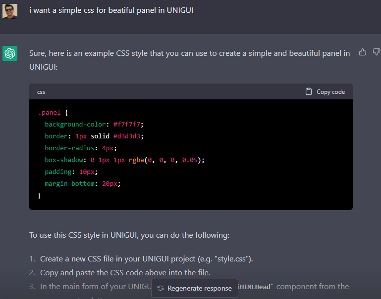 i want a simple css for beatiful panel in UNIGUI
Sure, here is an example CSS style that you can use to create a simple and beautiful panel in UNIGUI:
cssCopy code.panel { background-color: #f7f7f7; border: 1px solid #d3d3d3; border-radius: 4px; box-shadow: 0 1px 1px rgba(0, 0, 0, 0.05); padding: 10px; margin-bottom: 20px; }To use this CSS style in UNIGUI, you can do the following:
- Create a new CSS file in your UNIGUI project (e.g. "style.css").
- Copy and paste the CSS code above into the file.
-
In the main form of your UNIGUI application, add a
TUniHTMLHeadcomponent from the component palette. -
Set the
ExtraHeaderproperty of theTUniHTMLHeadcomponent to the following:
bashCopy code<link rel="stylesheet" type="text/css" href="style.css">-
In the form where you want to use the panel, add a
TUniPanelcomponent from the component palette. -
Set the
CustomStyleproperty of theTUniPanelcomponent to "panel".
Now, the
TUniPanelcomponent should have the CSS style applied to it, and it should have a simple and beautiful appearance. You can further customize the CSS style to your liking by modifying the values of the various properties in the style.-
1
-
-
yes, I understand
The idea of this site was very nice and I thought that maybe we could do something similar
ChatBase.co -
On 2/13/2023 at 11:49 PM, Fred Montier said:
1- This happens when you run with different uniGUI frameworks. Recompile.
2- Have you read the code ? Haven't you seen that is just a simple function ? Read a Combo Text, send the request and show response in memo. Simple REST stuff.function TMainForm.AskChatGPT(const aAPI, aQuestion: string): string;
Content removed !
ALL THE REST IS JUST COSMETIC ! Same for VCL !
Thank you for your guidance
Yes, I read the code and saw how you called the function.
What was important was the creativity used in the use of the UNIGUI.
And a question
Can we limit the answers to the analysis of a text? -
 Hello Fred
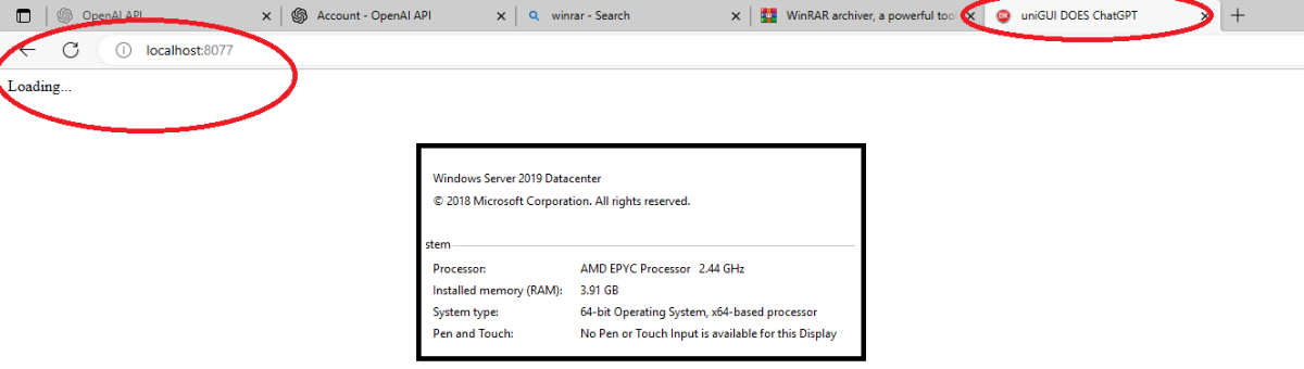
Thank you for your good program
It doesn't work for me and it stays on loading
Do you have any suggestions?
(You can see the server specifications in the photo) -
Simple online CSS Editor
-
.x-tab.x-tab-active {
   background-color: #2E86C1!important;
   border: none !important;
   border-radius: 3px 3px 0 0;
}
.x-tab.x-tab-active .x-tab-inner-default{
   color: #fff596 !important;
}
.x-tab-bar-horizontal .x-tab-bar-strip {
   background-color: #2E86C1!important;
   }
.x-tab-bar-top > .x-tab-bar-strip-default {
   border: none !important;
   height: 20px !important;
   }

.x-box-inner.x-box-scroller-body-horizontal {
   height: 19px !important;
   }
.x-panel-body-default {
   border-style: none !important;
   }

.x-tab-default-top {
    border-style: none !important;
    background-color: #D6EAF8!important;
    border-radius: 3px 3px 0 0;
   }
Result :
-
2
-
-
7 hours ago, Sherzod said:
Hello,
You need to set UniMainModule -> RecallLastTheme to True.
Tanks
It Works
-
I took this code to change the theme from the sample codes of the UNI folder, but it does not work in my program
Does anyone have any ideas?Explanation that the filling part of the theme works perfectly
But the theme changer does nothingprocedure TSettingForm.UniFormShow(Sender: TObject); var I : Integer; S : TUniStringArray; begin S := UniServerModule.ThemeManager.AllThemes; ThemeBox.Items.Clear; for I := Low(S) to High(S) do ThemeBox.Items.Add(S[I]); end; procedure TSettingForm.ThemeBoxChange(Sender: TObject); begin DMT.Theme:=ThemeBox.Text; end; -
1 hour ago, Sherzod said:
Could you make a simple testcase to reproduce your case?
I noticed the bug
'8' must be part of items to use in textso I wrote
TUniComboBox(Sender).items.clear; TUniComboBox(Sender).items.add('8'); TUniComboBox(Sender).itemIndex:=0; TUniComboBox(Sender).Text:='8'; -
2 hours ago, Sherzod said:
Hello,
Event works.
Which build, settings are you using?
uni-1.90.0.1558
unim-1.90.0.1558
I think its last version -
Hi again
why TUniCombobox.OnExit dosnt works?
procedure TDMT.ComboExit(Sender: TObject);
Begin
TUniComboBox(Sender).Text:='8';
End; -
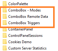
9 hours ago, Sherzod said:
\FMSoft\Framework\uniGUI\Demos\Desktop\ComboBox Remote DataFor example, the same demo. You can use OnRemoteQuery, OnRemoteQueryEx events.
Thank you for your answer, but I could not use it.
I need it to display several columns when it opens, and after selection, I can display the value of one of the columns as an answer and receive the entire selected answer as a string.
Like when you click on a column in a grid and select a record -
6 minutes ago, Sherzod said:
Hello,
Use what is currently available, you can display multiple fields. Please see related demos.
I cant find any sample about multiple fields in
C:\Program Files (x86)\FMSoft\Framework\uniGUI\Demos\Desktop
-
3 hours ago, Hayri ASLAN said:
We don't have this functionality in ExtJS. There are some solutions but unfortunately none of them 100% working.
Tanx for your answer
what you prefer ?
-
On 2/9/2016 at 8:05 PM, Pedja said:
Hi,
i am using onDrawColumnCell to paint row with different color based on some values:
if Grid1.DataSource.DataSet.FieldByName('Fieldname').AsString='Yes' thenbeginAttribs.Color:= $00E1FFFF;end;It works fine, but if i selected those painted row then is selection color not visible. How can i ignore row painting for the selected rows?Thanks
-
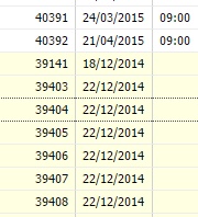
How I can show multiple columns (Name , Code ,Age ) in a Unicombobox like this ?
![ColumnComboBox[1].png](http://forums.unigui.com/uploads/monthly_2022_09/1394595063_ColumnComboBox1.png.4257b5ea587b19f0598529c11d46e42d.png)
-
Please share books , pdf , media or anything you think useful
this post shared from https://t.me/delphidevelop/798
and says :
QuoteTake a look at this GitHub repo. The author included documentation files about programming, Delphi, Lazarus, operating systems, cyber security, algorithms, mobile development, etc. 👀
May be you will find here some useful information for your work 👌
https://github.com/coderserdar/Documentsthis section is good :
3 months ago-
1
-
-
You can draw a red line below them to separate essential inputs from normal inputs
.EditNormal {
border-style: none none groove none;
border-width: 1px;
border-color: #3EC4ED;
box-shadow: 0px 1px 3px #BEE2F9;
background-image: none;
}
.Editnessecery {
border-style: none none groove none;
border-width: 1px;
border-color: #d90429;
box-shadow: 0px 1px 3px #BEE2F9;
background-image: none;
}-
1
-
Share my Css
in Components and Code Samples
Posted
One of the best sites for producing beautiful CSS.
You can give it a photo and download its color combination code