

MVakili
-
Posts
172 -
Joined
-
Last visited
-
Days Won
9
Content Type
Profiles
Forums
Events
Posts posted by MVakili
-
-
Hello
Thank you for your kindness
As stated from the beginning in this topic, it is necessary that
1- A form should be displayed
This page contains Persian calendar and for example 3 types of its pages are attached. It is acceptable to do any of these three examples.2- When the user clicks on one of the days in the calendar, the page will be closed and the date including day, month, and year will be returned
-
4 hours ago, Sherzod said:
Can you make a completed test project?

Is it my files?
no I cant
I download this projects from Github or web
-
4 hours ago, Sherzod said:
Hello,
What would you do if you put yourself in our place? How can we help you if we have no idea what you're coding and how?
That was a good point 😀
main problem very briefly
1- Display the Persian calendar in a modal form
2- If a date is passed for it, it will go to the same date (OnShow)
3- He can easily choose the desired date
4- Double click to return the selected date and close formAnd a series of other features that will be added later. For example
1- Have a parameter to display the Gregorian calendar values
2- The size of the calendar should be automatic.I searched the internet for various calendars with these features and found a few that were usable
But I don't know how to use them in UNIGUI
main program3 samples of JS codes
pwt.calheatmap-master.zip JalaliJSCalendar-1.4(PersianScript.ir).tar.gz JalaliDatePicker-main.zip HTML2.rar
-
9 hours ago, Sherzod said:
For example this demo:
\FMSoft\Framework\uniGUI\Demos\Desktop\HTTP Post Callback - HTMLFrame2
and a few more.
Tank you , I will check
The Persian planner and calendar make us some problem , I wish I find some way for it
Do you have any suggestions?
-
23 hours ago, Sherzod said:
Hello,
There are many ways to do this, also check out the demo examples.
Please tell me which example can help
-
Hello
I need such an example program, does anyone have an example?In the main form, I want to press the Select button and it will show another form that has HTML content
In the second form, the user selects the value and clicks OK, and the form is closed
And finally I can show the user's choice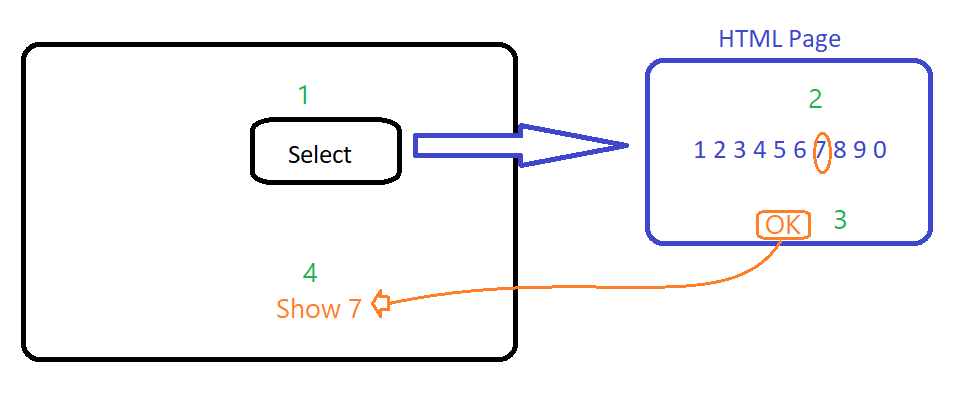
-
1- put (or create at runtime) a htmlframe and insert this code to make a matrix text
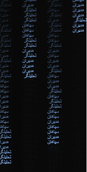
<html>
<head>
<meta charset="utf-8">
<meta name="viewport" content="width=device-width, initial-scale=1.0">

</head>
<body>
<canvas id=q>

<script language="javascript">

const s = window.screen;
const w = (q.width = s.width);
const h = (q.height = s.height);
const ctx = q.getContext("2d");

const p = Array(Math.floor(w / 10) + 1).fill(0);

const random = (items) => items[Math.floor(Math.random() * items.length)];

const hex = "تحلیلگر      سپاهان      مدیران".split("    ");

setInterval(() => {
  ctx.fillStyle = "rgba(0,0,0,.05)";
  ctx.fillRect(0, 0, w, h);
  ctx.fillStyle = "#8BF";
  p.map((v, i) => {
    ctx.fillText(random(hex), i * 50, v);
    p[i] = v >= h || v > 200 + 10000 * Math.random() ? 0 : v + 10;
  });
}, 2000 / 30);
</script>

</body>
</html>
-
 1
1
-
-
1- put (or create at runtime) a htmlframe and insert this code to make a simple analog clock
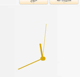
<!DOCTYPE html>


    <style>
 html {

  text-align: center;
  font-size: 10px;
}

body {
  margin: 0;
height:100%

}

.clock {
  width: 30rem;
  height: 30rem;
  border:  #282828;

  border-radius: 50%;
  margin: 50px auto;
  position: Center;


}

.outer-clock-face {
  position: relative;
  width: 100%;
  height: 100%;
  border-radius: 100%;


  overflow: hidden;
}


.inner-clock-face::before {
  content: '';
  position: absolute;
  top: 50%;
  left: 50%;
  width: 20px;
  height: 16px;
  border-radius: 18px;
  margin-left: -9px;
  margin-top: -6px;
  background: #D5A502;
  z-index: 11;

}

.hand {
  width: 50%;
  right: 50%;
  height: 6px;
  background: #D5A502;
  position: absolute;
  top: 50%;

  transform-origin: 100%;

  transition-timing-function: cubic-bezier(0.1, 2.7, 0.58, 1);
}

.hand.hour-hand {
  width: 20%;
  z-index: 3;
}

.hand.min-hand {
  height: 3px;
  z-index: 10;
  width: 35%;
}

.hand.second-hand {
  background: #D5A502;
  width: 45%;
  height: 1px;

}
    </style>
</head>
<body>
    <div class="clock">
        <div class="outer-clock-face">
          <div class="marking marking-one"></div>
          <div class="marking marking-two"></div>
          <div class="marking marking-three"></div>
          <div class="marking marking-four"></div>
          <div class="inner-clock-face">
            <div class="hand hour-hand"></div>
            <div class="hand min-hand"></div>
            <div class="hand second-hand"></div>
          </div>
        </div>
      </div>
  <script>

 const secondHand = document.querySelector('.second-hand');
const minsHand = document.querySelector('.min-hand');
const hourHand = document.querySelector('.hour-hand');

function setDate() {
  const now = new Date();

  const seconds = now.getSeconds();
  const secondsDegrees = ((seconds / 60) * 360) + 90;
  secondHand.style.transform = `rotate(${secondsDegrees}deg)`;

  const mins = now.getMinutes();
  const minsDegrees = ((mins / 60) * 360) + ((seconds/60)*6) + 90;
  minsHand.style.transform = `rotate(${minsDegrees}deg)`;

  const hour = now.getHours();
  const hourDegrees = ((hour / 12) * 360) + ((mins/60)*30) + 90;
  hourHand.style.transform = `rotate(${hourDegrees}deg)`;
}

setInterval(setDate, 1000);

setDate();
  </script>

</body>
</html>
-
If you like, share your visual effects in this thread
This will cause that
1- Newbies should be encouraged
2- Professionals can check the problems of your work -
On 2/11/2023 at 2:21 AM, MVakili said:
.x-tab.x-tab-active {
   background-color: #2E86C1!important;
   border: none !important;
   border-radius: 3px 3px 0 0;
}
.x-tab.x-tab-active .x-tab-inner-default{
   color: #fff596 !important;
}
.x-tab-bar-horizontal .x-tab-bar-strip {
   background-color: #2E86C1!important;
   }
.x-tab-bar-top > .x-tab-bar-strip-default {
   border: none !important;
   height: 20px !important;
   }

.x-box-inner.x-box-scroller-body-horizontal {
   height: 19px !important;
   }
.x-panel-body-default {
   border-style: none !important;
   }

.x-tab-default-top {
    border-style: none !important;
    background-color: #D6EAF8!important;
    border-radius: 3px 3px 0 0;
   }
Result :
I change round and colors for better view and removed "!important"
/*------------------- Page control tab control-------------------------------*/

.x-box-inner.x-box-scroller-body-horizontal {
	height: 19px;
}

.x-panel-body-default {
	border-style: none;
}

.x-tab-bar-default .x-box-scroller-disabled {
	cursor: not-allowed;
}

.x-tab-bar-horizontal .x-tab-bar-strip {
	background-color: #7EA8F8;
}

.x-tab-bar-strip-default {
	background-color: #e0e0e0;
	border-color: #000;
	border-style: solid;
}

.x-tab-bar-top > .x-tab-bar-strip-default {
	border: none;
	height: 20px;
}

.x-tab-default {
	background-color: #ececec;
	border-color: #00f;
	cursor: pointer;
	margin: 0 1px 0 0;
}

.x-tab-default .x-tab-icon-el {
	background-position: center center;
	height: 20px;
	line-height: 20px;
	width: 20px;
}

.x-tab-default .x-tab-inner {
	color: #333;
	line-height: 16px;
}

.x-tab-default-active .x-tab-inner {
	color: #333;
}

.x-tab-default-active,.x-tab-default-over {
	background-color: #e0e0e0;
}

.x-tab-default-left,.x-tab-default-right,.x-tab-default-top {
	border-bottom: 0 solid #ddd;
}

.x-tab-default-left-active,.x-tab-default-right-active,.x-tab-default-top-active {
	border-bottom: 0 solid #add2ed;
}

.x-tab-default-top {
	background-image: -webkit-linear-gradient(top,#fff,#fff);
	border-radius: 3px;
	border-style: solid;
	border-width: 0;
}

.x-tab-icon-el {
	top: -3px;
}

.x-tab-li {
	display: inline-block;
}

.x-tab.x-tab-active {
	background-image:linear-gradient(to top, #7EA8F8 0%, #FFFFFF 41%, #FFFFFF 66%, #7EA8F8 100%);
	border: 10px;
	border-radius: 3px;
}

.x-tab.x-tab-active .x-tab-inner-default {
	color: #000;
}
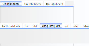
How can I increase the height of the Tabs?
-
On 8/31/2023 at 10:32 AM, MVakili said:
Thank you for your follow up
Yes, it may be because of CSS
It is possible to write a simple CSS for me
It is possible that I have used the wrong item in my instructions due to unfamiliarity with internal names
In the submitted example, I tried to include the related CSS but the problem does not occur/*------------------- Page control tab control-------------------------------*/ .x-box-inner.x-box-scroller-body-horizontal{height:19px!important}.x-panel-body-default{border-style:none!important}.x-tab-bar-default .x-box-scroller-disabled{cursor:not-allowed}.x-tab-bar-horizontal .x-tab-bar-strip{background-color:#7EA8F8!important}.x-tab-bar-strip-default{background-color:#e0e0e0!important;border-color:#000;border-style:solid}.x-tab-bar-top > .x-tab-bar-strip-default{border:none!important;height:20px!important}.x-tab-default{background-color:#ececec;border-color:#00f;cursor:pointer;margin:0 1px 0 0}.x-tab-default .x-tab-icon-el{background-position:center center;height:20px;line-height:20px;width:20px}.x-tab-default .x-tab-inner{color:#333!important;line-height:16px!important}.x-tab-default-active .x-tab-inner{color:#333!important}.x-tab-default-active,.x-tab-default-over{background-color:#e0e0e0}.x-tab-default-left,.x-tab-default-right,.x-tab-default-top{border-bottom:0 solid #ddd}.x-tab-default-left-active,.x-tab-default-right-active,.x-tab-default-top-active{border-bottom:0 solid #add2ed}.x-tab-default-top{background-image:-webkit-linear-gradient(top,#fff,#fff);border-radius:3px;border-style:solid;border-width:0}.x-tab-icon-el{top:-3px}.x-tab-li{display:inline-block}.x-tab.x-tab-active{background-image:-webkit-linear-gradient(left,#fff,#bdcbff,#fff);border:10px!important;border-radius:3px}.x-tab.x-tab-active .x-tab-inner-default{color:#000!important}
-
When you finish writing a CSS there are 2 other steps to consider
1- Troubleshooting: It is possible that there are errors in the code, for example, instead of 1px, you wrote only 1
2- Compression: It is important to increase the execution speedYou can use different sites for this
This is a good site and you can see the results of the previous codehttps://www.cssportal.com/css-optimize/
and final code
.rc-grid-title-check .x-column-header-checkbox{display:none}.x-column-header{background-color:#FFF;border:1px solid red;border-color:#7EA8F8;border-radius:2px;color:#000;height:40px!important;padding:1px;text-align:center;vertical-align:middle}.x-grid{background-color:#FFF;border-collapse:collapse;border-color:#7EA8F8;border-style:solid;border-width:1px;color:#000;width:100%}.x-grid .x-grid-cell{height:30px!important;line-height:30px!important}.x-grid td,.x-grid th{border-color:#7EA8F8;border-style:solid;border-width:2px;padding:5px}.x-grid-cell-inner{overflow:hidden;padding:5px 4px 4px!important;text-overflow:ellipsis;white-space:nowrap}.x-grid-header-ct .x-column-header-inner{white-space:nowrap}.x-grid-item-selected .x-grid-cell{background-color:#FFFFE0;border:1px solid #cce5ff;color:#00008B}.x-grid-td{vertical-align:middle}.x-toolbar-default{border-width:0;padding:6px 0 0}.x-toolbar-default .x-toolbar-separator-horizontal{border-width:0}.x-toolbar-text-default{color:#4b4c4c;padding:0 0 0 -8px}
-
A CSS for UniDBGrid
.x-grid-header-ct .x-column-header-inner {
  white-space: nowrap;
}

.x-column-header {
  border: 1px solid red;
  height: 40px !important;
 background-color:#FFF;
border-color:#7EA8F8;
border-radius:2px;
color:#000;
padding:1px;
text-align:center;
vertical-align:middle;
}
.x-grid-item-selected .x-grid-cell {
background-color:#FFFFE0;
border:1 solid #cce5ff;
color:#00008B;
}

.x-grid-cell-inner {
  padding: 5px 4px 4px!important;
  white-space: nowrap;
  overflow: hidden;
  text-overflow: ellipsis;
}
.x-grid-td {
  vertical-align: middle;
}
.rc-grid-title-check .x-column-header-checkbox {
  display:none;
}
.x-toolbar-text-default {
    padding: 0px 0px 0px -8px;
    color: #4b4c4c;
}
.x-toolbar-default .x-toolbar-separator-horizontal{
    border-width: 0px;
}
.x-toolbar-default {
    padding: 6px 0 0px 0px;
    border-width: 0px;
}


.x-grid .x-grid-cell {
    height: 30px !important;
    line-height: 30px !important;
}
.x-grid  {
background-color:#FFF;
border-collapse:collapse;
border-color:#7EA8F8;
border-style:solid;
border-width:1px;
color:#000;
width:100%

}

.x-grid  td,.x-grid  th {
 border-color:#7EA8F8;
border-style:solid;
border-width:2px;
padding:5px

}
-
-
On 8/15/2023 at 1:12 PM, MarcoZC said:
Good morning. I have two days trying to configure the customcss to be shown as I want. I have reviewed all the contributions to the CSS configuration forum of a Tunidbgrid component and I can't get it as I would like.
I am using version 1.90.0.1567 of Unigui, Delphi 11 version 28.0.48361.3236.
The maximum I have achieved is to show the unidbgrid in Zebra format using:
.x-grid-item-Alt {
Background-Color: #DFBF9F;
}
I am using the Triton-Modified theme and when I pass with the cursor on one of the items that are not even the line takes the default color of the theme, but when I pass on one of the item even the line does not change color.Looking on the Internet I have found this configuration that in principle adapts to what I want to do:
/ * General style for UNIDBGRID */
.STL-GRID {
Font-Family: Arial, Sans-Serif;
Border-Collapse: Collapse;
Width: 100%;
Margin: 10px 0;
}/ * Table header */
.stl-Grid Th {
background-color: #8b5a2b; /* Dark brown */
Color: #FFF; / * Blank text */
Padding: 8px;
Text-align: Left;
}/ * Even rows */
.STL-GRID TR: NTH-CHILD (EVEN) {
Background-Color: #F2E5C1; /* Light brown */
}/ * Odd rows */
.STL-GRID TR: NTH-CHILD (ODD) {
Background-Color: #E5D0A4; / * Another tone of light brown */
}/ * Normal cell */
.STL-GRID TD {
Padding: 8px;
}/ * Highlighted cell (for example, when passing the cursor on it) */
.STL-GRID TD.HIGHLIGHT {
Background-Color: #BF8040; / * Medium brown */
Color: #FFF; / * Blank text */
}/ * Selected cell */
.STL-GRID TD.SELECTED {
Background-Color: #A3662A; /* Dark brown */
Color: #FFF; / * Blank text */
}
But even if it includes it in the Grid Cls, directly on the component or do so by uniframecreate with dbgrid.jsinterface.jsconfig ('CLS', ['Stl-Grid']);
Only all the rows are shown in a color and when I move the cursor, nothing changes.Any help, please?
I tried to check this CSS but it dosnt work
may you send me a testcase
or you can try this one
-
-
A simple but interesting task
You can use a meter in Button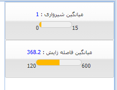
Var
   BTN : TUniButton;
begin
{ comment , general format for Html meter :
 '<lable> title  </lable></br><lable>Min Value </lable><meter min="0"  max="15" value="9" low="8" high="10.5"  ></meter><lable>Max Value</lable>'
}
   With Q Do // Q is a Table or query
      Begin
         first ;
         while Not Eof do
             Begin
                BTN:=TUniButton.Create(P);
                With BTN Do
                   Begin
                      Parent:=P;
                      Name:='BtnMeter_'+FieldByName('Seq').AsString;
                      Height:=75;
                      Caption:='<style>meter{width:70%;height:25px;}</style>'
                              +'<lable>'+FieldByName('T').AsString+' : '+'</lable>'
                               +'<lable style="color:blue">'+FieldByName('C').AsString
                              +'</lable></br></br><lable>'+FieldByName('MinV').AsString
                              +'</lable><meter min="'+FieldByName('MinV').AsString
                              +'"  max="'+FieldByName('MaxV').AsString
                              +'" low="'+FieldByName('LowV').AsString
                              +'" high="'+FieldByName('HighV').AsString
                              +'" value="'+FieldByName('C').AsString
                              +'"  ></meter><lable>'+FieldByName('MaxV').AsString
                              +'</lable>';
                      hint:=FieldByName('T').AsString+' : '+FieldByName('C').AsString+#13
                              +'Limit :'+FieldByName('LowV').AsString
                              +' - '+FieldByName('HighV').AsString;
                      ShowHint:=True;
                      Layout:='anchor';
                      LayoutConfig.Padding := '1';
                      LayoutConfig.BodyPadding := '1';
                      LayoutConfig.Width := '100%';
                   End;
                Next;
             End;

      End;
-
On 12/17/2023 at 7:39 PM, Fred Montier said:
You mean, printed numbers ? Text ? aka OCR ?
There are lots of examples on JS to do just that.The main purpose is to recognize this type of number
-
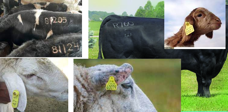
Hello Fred
You are really cool
Can we have a way to detect the number
Of course
with a mobile camera
And neither the size nor the circumference of the numbers are fixed
-
On 3/6/2020 at 6:21 PM, Wilton Ergon said:
my css collection, used in servermodule, customcss
/*------- TABS SETTINGS ---------------- */
/*Altera a parte superior da Tab, incluso tabs*/
.x-tab-default-top {
border-top-left-radius: 0; /*Radius arredonda os cantos*/
border-top-right-radius: 0;
border-bottom-right-radius: 0;
border-bottom-left-radius: 0;
padding: 5px 10px 10px 10px; /*T-R-B-L altura dos botões*/
border-width: 0 0 0 0; /*Borda dos Botões da Tab*/
border-style: none ; /*solid*/
border-color: #32404e;
background-color: #ffffff; /* #1e3b5e Cor do Botão da page */
background-image: none;
}/*Font color of the active Tab button*/
.x-tab-default-active .x-tab-inner {
color: #000000;
}/*Distance from the close button to the margins*/
.x-tab-default .x-tab-close-btn {
top: 4px;
right: 4px;
}
/*Intensity of background mask-box adjust Opacity*/
.x-mask
{
opacity: 0.4;
background: rgb(0, 0, 0) none repeat scroll 0% 0%;
}/*Opções do Hold Overlay*/
#holdon-overlay {
opacity: .7 !important;
}/*Removes the borders of the panels*/
.x-panel-body-default {
border-width: 0;
border-style: none;
padding: 0px 0px 0px 0px; /*Tab panel margin*/
}/*Coloca sombra em qualquer Panel*/
.pnlcard {
box-shadow: 0 8px 6px -6px gray !important;
background:white !important;
border: 1px solid silver !important;
}/*
.x-tab-bar-default-horizontal {
height: 0px;
}*//* Cores da Tab*/
.x-tab-bar-default{
border-style:none;
border-width:0 0 0;
border-color:#ffffff;
background-color:#ffffff;
background-image: none;
}/*Cor fonte pag ativa*/
.x-tab-active .x-tab-inner {
color: #ffffff !important;
}/*Button height in relation to the bottom edge of the Tab*/
.x-tab-bar-default-top {
padding: 5px 0px 5px 0px; /* T-R-B-L */
}/*Modifica a barra inferior do botão*/
.x-tab-bar-strip-default {
border-style: solid;
padding: 3px 3px 3px 3px; /*T-R-B-L altura dos botões*/
border-color: transparent;
background-color: #32404e;
}/*Cores de fontes do label da Tab em foco*/
.x-tab .x-tab-inner { font-weight: bold; color:#000000; border: none;}
.x-tab-over .x-tab-inner { font-weight: bold; color:#7c7c7c; border: none;}
.x-tab-active .x-tab-inner { font-weight:bold; color:#ffffff; border: none;}/*Cor tab mouse over*/
.x-tab-over.x-tab-default-top,
.x-tab-over.x-tab-default-left,
.x-tab-over.x-tab-default-right {
background-image: none;
background-color: #e3e3e3;
}/*Cor da Fonte da Tab Ativa*/
.x-tab.x-tab-active.x-tab-default .x-tab-inner-default {
color: #ffffff;
}/*Cor da Tab Ativa*/
.x-tab.x-tab-active.x-tab-default-top {
background-image: none;
background-color: #32404E;
}/*Cor da Tab ativa quando perde o foco*/
.x-tab.x-tab-active.x-tab-default-top {
background-image: none;
background-color: #32404e;
}/*Cor da Fonte da Tab desativada*/
.x-tab.x-tab-disabled.x-tab-default .x-tab-inner-default {
color: #ffffff;
}/*Cor da Tab Desativada*/
.x-tab.x-tab-disabled.x-tab-default-top, .x-tab.x-tab-disabled.x-tab-default-left, .x-tab.x-tab-disabled.x-tab-default-right {
background-image: none;
background-color: #e6e6e6;
}/*Cor de Foco com teclas*/
.x-keyboard-mode .x-tab-focus.x-tab-default {
border-color: #e6e6e6;
background-color: #e6e6e6;
}/*cor do botão da tab quando foco em tab ativa*/
.x-keyboard-mode .x-tab-focus.x-tab-over.x-tab-default {
border-color: #32404e;
background-color: #32404e;
}/*Cor do botão da tab quando recebe o foco*/
.x-keyboard-mode .x-tab-focus.x-tab-active.x-tab-default {
border-color: #32404e;
background-color: #32404e;
}/*---------- DEFAULT SETTINGS ----------------------*/
/*Colori e Arredonda os Edits*/
/*Fora de foco*/
.x-form-text {
border-radius: 1px;
-moz-border-radius: 1px;
-webkit-border-radius: 1px;
border-color: #E0E0E0;
box-shadow: 1px 1px 1px #E0E0E0;
}
.x-form-text:focus,
.x-form-text:hover,
.x-form-text:active{ /*Em foco*/
border-radius: 1px;
-moz-border-radius: 1px;
-webkit-border-radius: 1px;
border:1px solid gray !important;
background: #FFFFB4 !important;/*Amarelinho rgb(255, 255, 180)*/
box-shadow: 1px 1px 1px #E0E0E0;/*Cinza rgb(224, 224, 224)*/
}/*Changes button color and removes borders*/
/*Login button borders*/
.Border{border-radius: 50px;}
.Border:hover{border-radius: 50px;}/*BtnVideoAula*/
.bntVideoAula
{
background:#047b4a !important;/*Cor escura*/
-webkit-transition: background 0.2s ease-in-out;
transition: background 0.2s ease-in-out;
/*border: none !important;*/
border-radius: 50px !important;
}
.bntVideoAula:hover
{
background:#06bd70 !important;/*Cor clara*/
-webkit-transition: background 0.2s ease-in-out;
transition: background 0.2s ease-in-out;
/*border: none !important;*/
border-radius: 50px !important;
}/*BtnLogin*/
.bntLogin
{
background:#75a3a3 !important;/*Cor escura*/
-webkit-transition: background 0.2s ease-in-out;
transition: background 0.2s ease-in-out;
border: none !important;
border-radius: 0px !important;
}
.bntLogin:hover
{
background:#a3c2c2 !important;/*Cor clara*/
-webkit-transition: background 0.2s ease-in-out;
transition: background 0.2s ease-in-out;
border: none !important;
border-radius: 0px !important;
}/*Remove sombra dos forms*/
.x-css-shadow {
-webkit-box-shadow: none !important;
-moz-box-shadow: none !important;
box-shadow: none !important;
}.VerticalCSS{
transform: rotate(-90deg);
-webkit-transform: rotate(-90deg); /* Safari/Chrome */
-moz-transform: rotate(-90deg); /* Firefox */
-o-transform: rotate(-90deg); /* Opera */
-ms-transform: rotate(-90deg); /* IE 9 */
}.x-btn-default-large{
background-color: rgb(65, 65, 65) !important;
background-image: none !important;
border-width:0 !important;
}.x-btn-default-large-over
{background-color: rgb(85, 85, 85) !important;}.x-accordion-hd .x-tool-expand-top, .x-accordion-hd .x-tool-expand-bottom
{background-position:0 -176px;}.x-accordion-hd .x-tool-collapse-top, .x-accordion-hd .x-tool-collapse-bottom
{background-position:0 -224px;}.menubtn{
text-align: left;
float: left;
width: 70%;
margin-left: 20px;
margin-top: -2px;
}.iconright{
text-align: right;
float: right;
width: 8%;
margin-top: -6px;
}.div100{
width: 100%;
padding-top:5px;
}.iconWhite .fa-sf-white{
color: white;
}.iconYellow .fa-sf-white{
color: yellow;
}.fa-sf-inverse
{
color: rgb(44, 69, 89);
}.f-btn-transparent:focus, .f-btn-transparent:hover
{
border-color:rgb(97, 123, 145);
background-color:rgb(97, 123, 145);
}.btfocus:hover
{
border-color:#E0E0E0;
background-color:#E0E0E0;
}/*Form borders*/
.x-window-default{/*No assignment in separate forms Login Support is too big*/
background-color: white;
border-color: #E0E0E0;/*Gray rgb(224, 224, 224)*/
border-radius: 0px;
border-style: none;
border-width: 0px;
border-height: 0px;
padding: 0;
/*height:519px !important; /*size of your form - 10px*/
/*width:669px !important; /*size of your form - 10px*/
}.NotValid {
border-style: solid;
border-width: 1px;
border-color: Red;
}
/*Colorir Menu principal*/
/* ._treemenu .x-treelist, ._treemenu .x-treelist-row{
background-color: #2c4559;/*Cor Escura*/
/*}._treemenu .x-treelist-row-over{
background-color: #252F38;/*Cor Clara*/
/*}*//*UniTreeMenu - Inicio*/
/* Aqui ira determina a COR DE Fundo do menu */
.x-treelist-nav
{
background-color: [[MENU_COLOR]] !important;/* #32404e; moccasin; */background-repeat: no-repeat;
background-attachment: fixed;
background-image: url( 'https://gepimagens.ergonsistemas.com.br/Backgroud_620x1080.png');
/*background-image: url( 'files/Backgroud_Menu/Backgroud_4.png' );*/
background-position: 0px 50% !important;padding: 0 0 0 0;
overflow: auto !important;
scrollbar-width: thin; /*estilo do scrool para o mozilla */
scrollbar-color: #778088 #d6d9db; /*estilo do scrool para o mozilla */
}.x-treelist-nav .x-treelist-item-text
{
/*Left side menu*/
color: White; /*menu letter color*/
margin-left: 27px; /*27 left-to-right spacing of menu items*/
margin-right: 15px; /*spacing from left to right of menu groups*/
font-size: 16px; /*letter size*/
line-height: 30px; /*menu line height*/
}.x-treelist-nav .x-treelist-item-icon:before,
.x-treelist-nav .x-treelist-item-tool:before,
.x-treelist-nav .x-treelist-item-expander
{
line-height: 30px; /* 44 é o padrao */
color: White;
}/*Menu Expandidos*/
.x-treelist-nav .x-treelist-item-expanded
{
background-color: #324f67 !important;
}/*Menu Selecionado*/
/*Modelo 1*/
.x-treelist-nav .x-treelist-item-selected > .x-treelist-row::before
{
background-color: #008ae6 !important;
}
/*Modelo 2*/
/*.x-treelist-nav .x-treelist-item-selected > .x-treelist-row
{
background-color: #008ae6 !important;
}*//*Passa o mouse*/
.x-treelist-nav .x-treelist-row-over{
background-color: #808080 !important;
}.x-treelist-nav::-webkit-scrollbar
{
width: 7px;
height:7px;
background:#d6d9db;
}.x-treelist-nav::-webkit-scrollbar-track
{
background: rgba(0,0,0,0.1);
}.x-treelist-nav::-webkit-scrollbar-thumb
{
border-radius: 7px;
height:7px;
background:#778088;
}
/* UniTreeMenu - Fim *//* Altura da linha na Grid */
.GridLotacao .x-grid-column {
height: 20px;
}.GridLotacao .x-grid-cell {
height: 20px !important;
line-height: 20px !important;
}
ChatGPT says
The CSS code you've posted is quite extensive and overall, seems to be written accurately in terms of proper CSS syntax. However, there are some points worth mentioning that could potentially be errors or areas of improvement:
1. The comment syntax `/* ... */` seems to be used correctly, but make sure that every opening `/*` has a closing `*/`. Unmatched comment tokens can result in some rules being unintentionally commented out.
2. Custom properties or variables like `[[MENU_COLOR]]` in the `.x-treelist-nav` selector:
```
background-color: [[MENU_COLOR]] !important;
```
This isn't standard CSS and might be placeholders for a CSS preprocessor or a string replacement system. Ensure that these are being processed correctly into valid CSS values before running the CSS on a live site.3. Specificity and `!important`: There's heavy use of `!important` which should generally be avoided if possible due to specificity wars, making it hard to override with other CSS rules.
4. Vendor Prefixes: I see usage of `-moz-` and `-webkit-` vendor prefixes. Depending on the browsers you are aiming to support, you might not need these anymore, as many CSS properties are now standardized and don't require prefixes. However, if you need to support older browsers, keep them.
5. Overqualified Selectors: Selectors like `.x-grid-column` and `.x-grid-cell` don't have any classes or IDs associated with them, which could potentially apply styles unintentionally to elements in other contexts where you might have a `.x-grid-cell` that isn’t part of `.GridLotacao`.
6. Units on Zero Values: Zero values do not need units, you've properly used `0` instead of `0px` in most places, just ensure consistency.
7. Hexadecimal Color Values: Upper and lower case are mixed in the color values. This isn't an error, but for consistency and readability, you might want to stick with one, usually lowercase is preferred.
8. Use of Comments: Some CSS rule sets are commented out, like:
```
/*.x-tab-bar-default-horizontal {
height: 0px;
}*/
```
If these rules are not needed, it's better to remove them entirely to clean up the code.Please note that without the context of the HTML structure and without testing this in a browser, it's difficult to say if the selectors match as intended or if there might be logical errors in the design (e.g., incorrect colors, sizes, etc.). You should test this CSS in the context of your project and see if it behaves as expected. If not, further adjustments might be necessary.
-
Css for RTL uniTreeMenu + TUniMenuItems ( tanks Majid )
.x-treelist-item-expander:after {
    content: "\f0d9";
}

.x-treelist-nav .x-treelist-item-expander {
    /*right: 150px;*/
}

.x-treelist-nav .x-treelist-row-over:before, .x-treelist-nav .x-treelist-item-selected > .x-treelist-row:before {
/*   right: 150px;*/
    content: " ";
    position: absolute;
    display: block;
    /* left: 0; */
    right: 0;
    top: 0;
    width: 6px;
    height: 100%;
}

/*How to change UniTreeMenu's background color?*/
.treemenu .x-treelist, .treemenu .x-treelist-row{
  background-color: #10044a;
}

.treemenu .x-treelist-row-over, .treemenu .x-treelist-nav .x-treelist-item-selected > .x-treelist-row{
  background-color: #40366e !important;
}

.treemenu .x-treelist-item-text, .treemenu .x-treelist-item-icon, .treemenu .x-treelist-item-expander {
  color: #e8dff7;
    font-size: 14px;
}
-
Hi
This below sample do Login with admin in the login box In this case, for example, in another tab of the browser, you message again with the same login user that you have logged in elsewhere. and closes that session The second time it takes about 10 until 15 seconds, it is recognized and restarted to the login window. I don't know the reason for this delay.
Plesae help me for fix it. -
A complete reference for CSS commands
https://developer.mozilla.org/en-US/docs/Web/CSS/animation-iteration-count -
This site is great
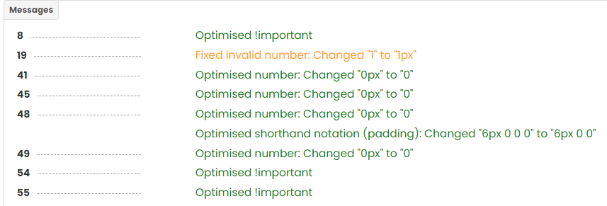
If you don't feel like optimizing your CSS codes, it will easily organize them for you
Writes the description of each section for you
And if it modifies, it will keep you informed of the changeshttps://codepal.ai/css-optimizer
Example
/*------------------- badge
-------------------------------
*/

.badge{
    display:inline-block;
    min-width:10px;
    padding:3px 7px;
    font-size:12px;
    line-height:1;
    vertical-align:middle;
    background-color:#777;
    border-radius:10px
}
.badge:empty{
    display:none
}
.btn .badge{
    position:relative;
    top:-1px
}
answer
 Optimize CSS


/*------------------- badge -------------------------------*/

/* Common styles for badge */
.badge {
  display: inline-block;
  min-width: 10px;
  padding: 3px 7px;
  font-size: 12px;
  line-height: 1;
  vertical-align: middle;
  background-color: #777;
  border-radius: 10px;
}

/* Hide badge if it's empty */
.badge:empty {
  display: none;
}

/* Position badge inside button */
.btn .badge {
  position: relative;
  top: -1px;
}

Get data HTML
in General
Posted
Thank you dear friend
I hope I can repay your favor